The Matching Door and Window Myth
The matching door and window myth can flatten a rural facade. Learn how to balance contrasting colours and finishes without making the elevation feel disjointed.
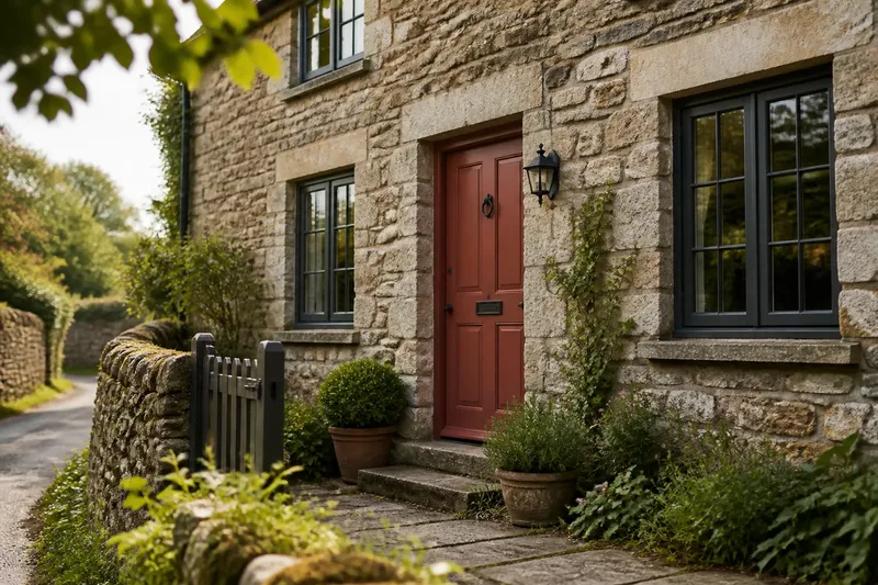
The common mistake is repainting a sound front door simply to match the windows; it can remove the one clear point of welcome on the facade without making the rest of the building feel more coherent. The matching door and window myth treats unlike elements as a set, when a considered difference in colour or finish can suit a country house better.
Doors and windows do not have to match. They do need to look as if they belong to the same building. When contrast feels wrong, the cause is usually not contrast itself but an unplanned relationship between colour, material, trim and the surrounding walls. Work through those details in order before choosing another paint colour.
Read the existing materials
Begin with what is already there, rather than a paint chart. Look at the walling, roof, stone or brick dressings, and any existing timber features in daylight. Note which colours recur and whether surfaces are matt, weathered, glossy or naturally varied.
A painted timber door beside pale stone and dark-framed windows may need a different treatment from a painted door beside warm brick and unpainted oak. The same colour can look cool against one wall and muddy against another. Hold a large sample near the entrance and view it from the path as well as close up.
Do not assume every visible material needs to be copied. A useful starting point is to let one feature carry the strongest contrast, while the other openings sit more quietly within the wall. Like choosing a plain frame for a patterned picture, restraint around the focal point helps it read clearly.
Find the source of discord
If the facade feels disjointed, identify the specific conflict before changing anything. Is the door much brighter than the windows? Does its finish look newly glossy beside old, subdued surfaces? Does the trim introduce a colour that appears nowhere else? Each problem calls for a different adjustment.
- The door shouts: a vivid or very light door can dominate a wall of subdued openings. Try a deeper, less saturated shade, or reserve the brightest tone for a smaller detail.
- The windows disappear: a dark door against pale walls may feel detached if the windows are pale too. Repeat a small amount of the door colour in a modest feature, such as a gate latch or a restrained painted detail, if it suits the setting.
- The finishes clash: a high-gloss door can look overly sharp beside weathered timber or softly textured masonry. Consider a more subdued finish rather than forcing the colours to match.
- The trim competes: several strong colours around one entrance can make each element seem unrelated. Simplify the trim so the door and window frames have room to differ.
Change one relationship at a time. If you alter the door, frames and trim together, it becomes difficult to tell which change improved the balance. Keep a note of the existing colours and take a photograph from the public approach; the view from indoors may make the contrast seem stronger or weaker than it does outside.
Balance colour and finish
There are several ways to create a deliberate contrast. A painted door can sit comfortably with stained timber windows, or dark frames can be paired with a lighter door. The wall itself may provide the bridge: a warm door colour can relate to brick, while muted green or grey can sit naturally among stone, lime render and planting.
Choose the contrast according to the building’s character, not a rule about rural colours. A traditional-looking facade is not automatically improved by making every timber element the same dark shade. Equally, a strong modern colour can appear abrupt if nothing else on the elevation supports its temperature or intensity.
Finish matters as much as colour. Painted wood, stained timber and metal frames reflect light differently, even when their colours seem close on a sample card. Compare finishes in the actual setting, and avoid judging them under one lamp or at one time of day. A colour that looks balanced in shade may become unexpectedly bright in direct sun.
Check the whole elevation
Stand far enough back to see the whole front, then look at the entrance and windows separately. Ask whether the door is easy to pick out without pulling attention away from the rest of the building. Check the relationship between the door, the nearest window, the wall colour and any visible boundary or garden features.
Imagine a modest stone cottage with charcoal-painted window frames and a faded red door. The owner wants a calmer entrance but does not want to lose its distinction. They try a muted red sample beside the stone and charcoal, then view it from the lane; the expected result is a door that remains recognisable while sitting more quietly against the wall. If the sample still feels isolated, they can adjust its tone rather than repaint the windows to match.
Use samples large enough to show the colour properly. A tiny chip can conceal how a shade behaves across a broad door panel. If the door has raised panels or mouldings, look at the sample across both shaded recesses and areas that catch the light.
Choose an order of changes
When a facade still feels unsettled, make decisions in a calm sequence:
- List what stays: record fixed materials and features you do not plan to alter, such as stonework, brick, roof covering or established timber.
- Choose the focal point: decide whether the entrance or the windows should lead the view. Avoid giving every element equal visual weight.
- Set the relationship: choose whether the door will contrast in colour, finish or both. A difference in just one quality can be enough.
- Test the sample: place it beside the relevant materials and view it from the approach in changing light.
- Review before expanding: if the door works, leave the frames alone. If it does not, revise the door sample or simplify the trim before considering broader changes.
For paint compatibility, preparation and suitable finishes, follow the product label and the door or window manufacturer’s instructions; local restrictions may apply to some buildings.
Questions about contrast?
Can a front door be a different colour from the windows?
Yes. A distinct door can give the entrance its own character while the windows remain quieter. Relate the colours through their warmth, depth or connection to the wall materials rather than matching them exactly.
Should the door match the trim?
Not necessarily. A door can differ from the trim, but several competing shades around the entrance may look busy. If the contrast feels scattered, simplify the trim before changing the door.
Can painted doors sit beside natural timber windows?
They can, provided the painted colour makes sense beside the timber’s tone and the surrounding masonry. Compare a sample with the actual timber, since wood grain and age create variation that a paint chart cannot show.
What if the house has already been painted in several colours?
Choose which feature should lead, then reduce the visual competition around it. You may be able to quiet the trim or revise one conspicuous colour rather than repaint every door and window.
Keep the difference deliberate
The matching door and window myth is easy to believe because matching is simple to specify. A more useful test is whether each finish has a clear place in the facade. Let the wall materials set the context, give one feature a little more emphasis, and review the result from the path. A thoughtful contrast can make a rural exterior feel more settled than an exact match.